Android’s New Design Language Appeals to Gen Z
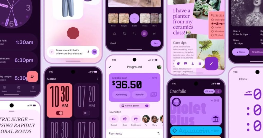
Android’s latest design aesthetic is clearly targeted towards a younger audience. This is evident from the recently leaked images that showcase Google’s new customizable interface featuring vibrant colors like pink, purple, and coral. The overall vibe is fun and youthful, moving away from the traditional shades of blue often associated with past designs. Google aims to refresh its image, though the effort may not significantly sway younger users who tend to favor the iPhone.
While Android maintains its position as the leading mobile operating system globally, it lags in popularity among U.S. youth, with Apple capturing a significant share of the market. According to a 2025 survey, 88% of teenagers own an iPhone, and a 2023 article noted that bringing an Android phone to school often leads to ridicule, indicating that Android is perceived as outdated.
The screenshots revealed in the blog offer a glimpse into Google’s attempt to engage younger users. Building upon the “Material You” concept introduced with Android 12, the new design allows users to customize color palettes based on their wallpapers. This feature has been somewhat mirrored by Apple in iOS 18, which includes color-tinted icons. Material Three amplifies these elements with bolder typography, larger icons, and a wider array of vibrant hues.
Google claims that Material Three is its most extensively researched update, derived from 46 studies involving over 18,000 participants. The company emphasizes its appeal, with younger users showing the strongest preference for the new designs. Interestingly, the update also claims to improve usability for older users, suggesting that the design enhances performance for all age groups.
However, skepticism remains regarding Google’s focus on so-called “Coolness Attributes.” It raises the question of how these metrics will influence user behavior, especially when the reality remains that Android users often experience the stigma of the “green bubble” in group chats.
Apple has strategically locked users into its iMessage platform, a crucial factor in retaining them within its ecosystem. Even with advancements like RCS improving cross-platform messaging, Android still faces challenges in achieving parity with iMessage. To truly increase Android’s appeal, a shift by Apple to open iMessage could have a more substantial impact than any design improvements from Google.
Ultimately, while Material Three represents a positive direction in Android’s design strategy, the deep-rooted brand loyalty towards Apple in the U.S. poses a significant obstacle. Although regulatory efforts are underway to address this imbalance, it seems that aesthetic changes alone won’t be enough to alter the competitive landscape.


