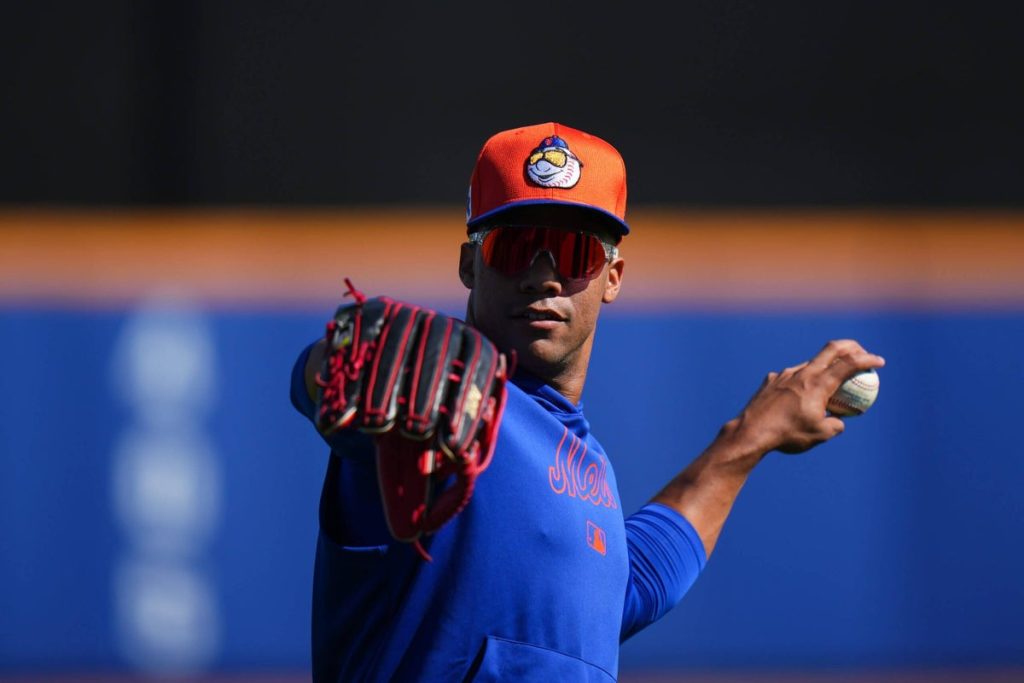
Although the Los Angeles Dodgers and Chicago Cubs are already in their regular season, other teams are still wrapping up Spring Training. Today, we’re highlighting Spring Training hats. After watching some games recently, many of us have formed opinions on the various caps. Here are our top five favorites along with our least favorite selections. We’d love to hear your opinions in the comments.
David’s Top Picks:
1. Washington Nationals
As a native Washingtonian, I might be a bit biased, but I genuinely appreciate this hat. I’m a fan of the “curly W” on Nationals hats, as it stands out similarly to other iconic team logos. The retro Washington Senators style is enhanced by a bold dark navy blue “W,” with just a touch of red and white to make it pop. I hope the Nationals consider using this color scheme for their game hats in the future. I bought this as soon as I saw it, and I’m actually wearing it while writing this.
2. New York Mets
With the signing of Juan Soto and the fun Mr. Met mascot, this Spring Training hat represents a refreshing new chapter for the Mets. The vibrant orange, paired with a hint of blue, captures the essence of the team while still feeling festive for Spring Training. Also, Mr. Met donning his classic blue hat on the logo adds an enjoyable element to the cap.
3. Chicago White Sox
Despite a tough season in the past, I’d gladly wear this hat if I were a White Sox fan. The design features a simple color reversal where black becomes grey and vice versa. This aesthetic resembles a cookies and cream theme, which could make for a great Spring Training look next season!
4. Chicago Cubs
You can hardly go wrong with a baby bear logo! The combination of the blue cub replacing the “C” with a white outline and pairing it with a light sky blue cap is spot-on. The overall design makes it one of the more fashionable options for Spring Training 2025, almost resembling an alternate Chicago Bears cap.
5. Milwaukee Brewers
Although I’m not a Brewers fan, I appreciate their unique “glove” logo which cleverly combines the letters “m” and “b.” The yellow and blue color palette also works well together, reminiscent of the successful color scheme seen in Wolverine’s branding.
Least Favorite: Los Angeles Angels
The Angels could have put more creativity into their Spring Training hat, as it seems to mimic their regular season cap too closely. This design doesn’t stand out, similarly to how the Cincinnati Reds have approached their Spring Training options. Michael Trout deserves a better hat as he prepares for the season!
Brooks’ Top Picks:
1. Detroit Tigers
This alternative hat design featuring the Tigers’ “D” is striking, even though it carries a hint of Cincinnati Bengals style. However, the tiger head still conveys seriousness, making it eye-catching.
2. Seattle Mariners
The isolated compass symbol from the Mariners logo translates beautifully onto this hat. Using “northwest green” adds a vibrant Spring feel, making it something I could easily envision Ken Griffey Jr. wearing.
3. New York Mets
Echoing David’s sentiments, this Mets hat brims with fun, as it features Mr. Met in sunglasses, something more teams should consider for their Spring Training caps. It’s so popular that it’s sold out on various shopping sites.
Least Favorite: Los Angeles Dodgers
The Dodgers’ script “D” on this cap seems out of place. They might have been more successful had they featured Shohei Ohtani’s face, creating a compelling spring highlight!
Note: The Athletic maintains full editorial independence in its coverage. When you click on or make purchases through our links, we may earn a commission.


