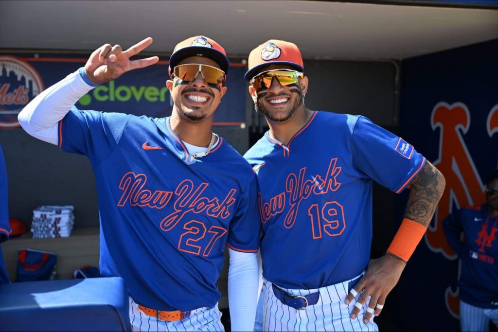
New Mets Jerseys Reflect History and Modern Design
James Benesh, the vice president of ballpark experience for the New York Mets, understands how uniforms capture the essence of a baseball team’s history. He knows that the Mets’ standout teams from the 1980s are forever linked to the racing stripes on their jerseys, just as the successful “Mojo Rising” teams in the early 2000s are associated with their black uniforms, and Matt Harvey’s peak performances came while sporting royal blue.
Benesh aims to create a uniform that fans will associate with this current chapter of New York Mets baseball.
As the Mets kick off their season with series in Houston and Miami, they will debut two new road uniforms: a modified version of their traditional gray jerseys and a fresh blue alternate road jersey. This reflects a gradual evolution that began years ago.
This process differs significantly from the creation of the Mets’ City Connect jerseys last season, which were designed based on a prompt from Nike. The new road jerseys emerged from a series of discussions that progressively brought them to fruition.
The initial idea arose during player feedback sessions for the City Connect jerseys, where there was a consistent call for a new road alternate. After the Mets discontinued their previous blue alternates (which featured “New York” in gray serif print) following the 2021 season, the team realized there was room for a new design.
As considerations for the road alternate developed, the organization recognized that one of their four traditional jerseys needed to be used during spring training. The decision was made to create a blue alternate jersey that would be suitable for spring.
The team’s equipment manager, Kevin Kierst, proposed a design featuring bolder striping that involved blue outlining an orange stripe, reminiscent of the Mets’ iconic racing stripes from the 1980s. This design influence contributed significantly to the aesthetic of the new jersey, incorporating elements on the sleeves, collar, and pants.
Ultimately, the new “New York” script from the 1987 road gray uniforms was adapted into the designs after positive feedback from both players and fans on practice hats featuring the script. The Mets aimed to use this script effectively across different merchandise, allowing more versatility while aligning with Major League Baseball’s logo guidelines.
All these considerations led to several key design choices: using stealth lettering by keeping the “New York” script in blue on a blue jersey with orange outlines, creating a pullover rather than a button-up, and even experimenting with their traditional gray jerseys. The anticipation is that these new uniforms will resonate with fans for years to come, making them a lasting part of the Mets’ legacy.


